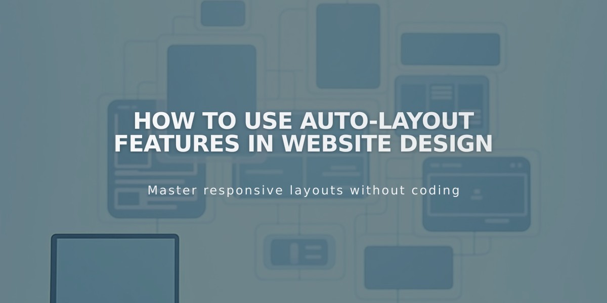
How to Use Auto-Layout Features in Website Design
Auto-layouts offer a flexible way to display content groups like team members, projects, or testimonials in customizable arrangements. Content automatically rearranges based on your settings, making it perfect for frequently updated information.
Add an Auto Layout Section:
- Click Edit on the page
- Click Add Section
- Select People, Services, or Testimonials
- Choose a layout with an 'i' symbol
Customize Elements Display:
- Toggle section elements: Title, Button
- Toggle individual elements: Image, Title, Body Text, Button Note: Settings apply to all elements within a section
Managing Content:
- Click Edit Content > Content
- Add new elements or edit existing ones
- Reorder using the :: icon
- Delete using the trash can icon
Available Layouts:
- Simple List: Left-to-right row display
- Banner Slideshow: One item at a time with background image
- Carousel: Rotating horizontal display
Design Customization:
- Access via Edit Content > Design
- Adjust text size, spacing, and image cropping
- Modify colors through Website Styles
- Add section dividers for visual separation
Mobile Considerations:
- Navigation arrows always display on mobile devices
- Design options may vary between desktop and mobile
Style Settings:
- Fonts follow global website settings
- Button designs maintain consistency across the site
- Text size can be customized within the auto layout settings
Auto-layouts vs Gallery Sections:
- Auto-layouts: Better for text-heavy content with images
- Gallery sections: Optimal for image-focused presentations with minimal text
Each layout type preserves its settings, allowing easy switching between different arrangements while maintaining your customizations.
Related Articles
How to Choose and Customize Your Perfect Squarespace Template - A Complete Guide