Squarespace Image Cropping Troubleshooting Guide
Images play a crucial role in your website's visual appeal. Understanding how cropping works helps you maintain a professional look across all devices.
Image Containers and Cropping Basics
Images are placed within containers that control their display. Two main scenarios occur:
- Images match container dimensions and may be cropped to fill the space completely
- Container adjusts to match image dimensions, showing the entire image
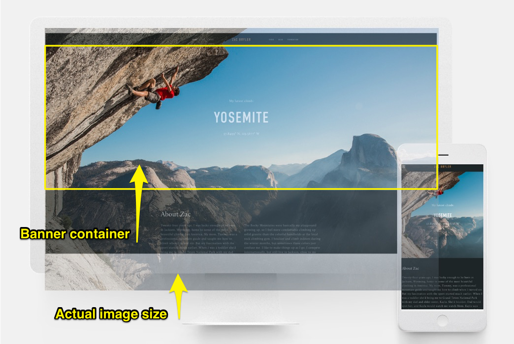
Climber on a steep rock face
Image Block Tips
- Fill setting: Images crop when resized
- Adjust setting: Maintains original aspect ratio
- Use cropping tool to center images
- Add spacing blocks to reduce image size
Banner Guidelines
- Use consistent aspect ratios for predictable cropping
- Adjust content overlap to control banner height
- Modify banner size settings
- Use image cropping feature for centering
- Consider mobile display requirements
Background Images and Videos
- Control cropping through section height/width
- Images can repeat, fit to dimensions, or fill screen
- Keep images under 2500 pixels for mobile compatibility
Gallery Management
- Upload images directly to gallery sections
- Choose appropriate format (Slideshow, Grid, Carousel, Stack)
- Use similar aspect ratios for consistent display
- Adjust thumbnail ratios and columns as needed
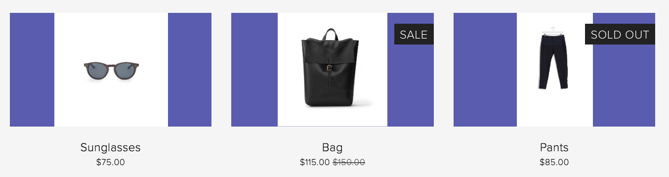
Reduced sunglasses and black leather bag
Shop Page Optimization
- Maintain consistent product image aspect ratios
- Use built-in image editor for uniformity
- Choose between automatic or custom cropping
- Adjust overlay colors for uncropped images
Black dress on hanger
Cover Page Considerations
- Expect some cropping on mobile devices
- Cropping varies based on:
- Image height
- Browser width
- Selected layout
Following these guidelines ensures your images display professionally across all devices while maintaining visual consistency throughout your website.
Related Articles

How to Add Custom Name Servers to Your DNS Records