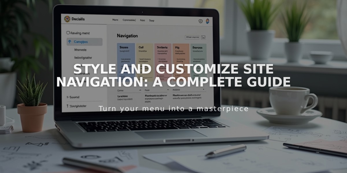
Style and Customize Site Navigation: A Complete Guide
Navigation links play a crucial role in directing visitors through your site. Here's how to customize their appearance:
Font and Size Customization (Version 7.1)
- Open "Site Styles" in the Design panel
- Click > next to "Fonts"
- Select "Allocate Styles"
- Choose "Site Navigation"
- For font changes:
- Click "Style" and select "Custom"
- Choose font family, weight, and style
- Click Save
For size changes:
- Click "Size"
- Select preset or custom size
- Adjust slider or enter rem value
- Click Save
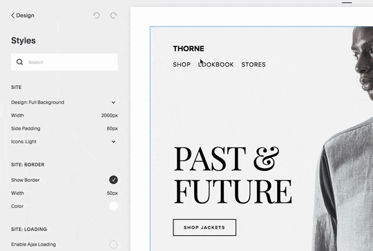
Navigation style demonstration
Color Adjustments (Version 7.1)
- Open header editor
- Click "Style"
- Select "Navigation Color"
- Choose color for links and social icons
Layout and Spacing
Desktop:
- Position varies by template
- Adjust spacing through header settings
- Control link padding and margins
Mobile:
- Collapses into menu icon (☰)
- Customizable through header editor
- Inherits desktop styling for consistency
Navigation Display by Template Family:
- Adirondack: Horizontal, centered top
- Brine: Horizontal, adjustable position
- Bedford: Horizontal, upper right
- York: Horizontal, customizable position
Mobile Navigation Tips:
- Always appears as menu icon or text
- Cannot modify font size
- Inherits desktop styling
- Some templates offer additional mobile customization
Important Notes:
- Header buttons always collapse on mobile
- Navigation layout depends on template family
- Mobile breakpoints vary by template
- Some templates allow icon customization
For hiding mobile navigation icons:
- Brine/Farro families:
- Open Site Styles
- Find Mobile Version: Menu Icon
- Set Menu Icon Position to Hide
For desktop menu optimization:
- Keep navigation titles concise
- Reduce number of links
- Consider using dropdown menus
- Group related pages together
Related Articles

Choose the Perfect Template for Your Squarespace Website