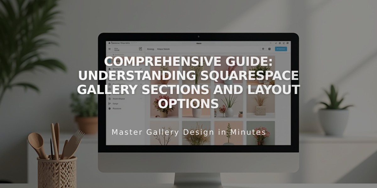
Comprehensive Guide: Understanding Squarespace Gallery Sections and Layout Options
A gallery section allows you to showcase images in customizable layouts on your website. Choose from various gallery types to create visually appealing image displays with optional captions and interactive features.
Gallery Types Available:
- Grid: Simple - Equal rows and columns
- Grid: Strips - Varying image sizes in rows
- Grid: Mosaic - Staggered layout with different aspect ratios
- Slides: Simple - Single image slideshow with optional thumbnails
- Slides: Full - Borderless single image slideshow
- Slides: Reel - Multiple images displayed simultaneously
Adding a Gallery Section
- Navigate to Pages panel and click +
- Select Page Designs > Gallery
- Add page title
- Click Edit
- Use image icon to add/edit images
- Click pencil icon for style modifications
- Save changes
Adding Images
- Hover over gallery and click image icon
- Press + to add images
- Choose Upload Images or Search Images
- Add up to 250 images per gallery section
Image Customization Options:
- Edit images using Image Editor
- Adjust focal points
- Reorder images (except in Grid: Mosaic)
- Add captions and alt text
- Include clickthrough URLs
- Delete unwanted images
Style Modifications
Access style settings through the pencil icon to adjust:
- Layout type
- Spacing
- Image height
- Caption display
- Lightbox functionality
- Color themes
- Section width (No Borders, Full, or Boxed)
Important Notes:
- Gallery sections support images only (no videos)
- Layouts may adjust responsively on different devices
- Maximum 250 images per gallery
- Cannot add blocks within gallery sections
- Width appearance may vary based on browser size and site settings
This feature provides a professional way to showcase image collections while maintaining design flexibility and user engagement.
Related Articles

How to Choose and Customize Your Perfect Squarespace Template - A Complete Guide

