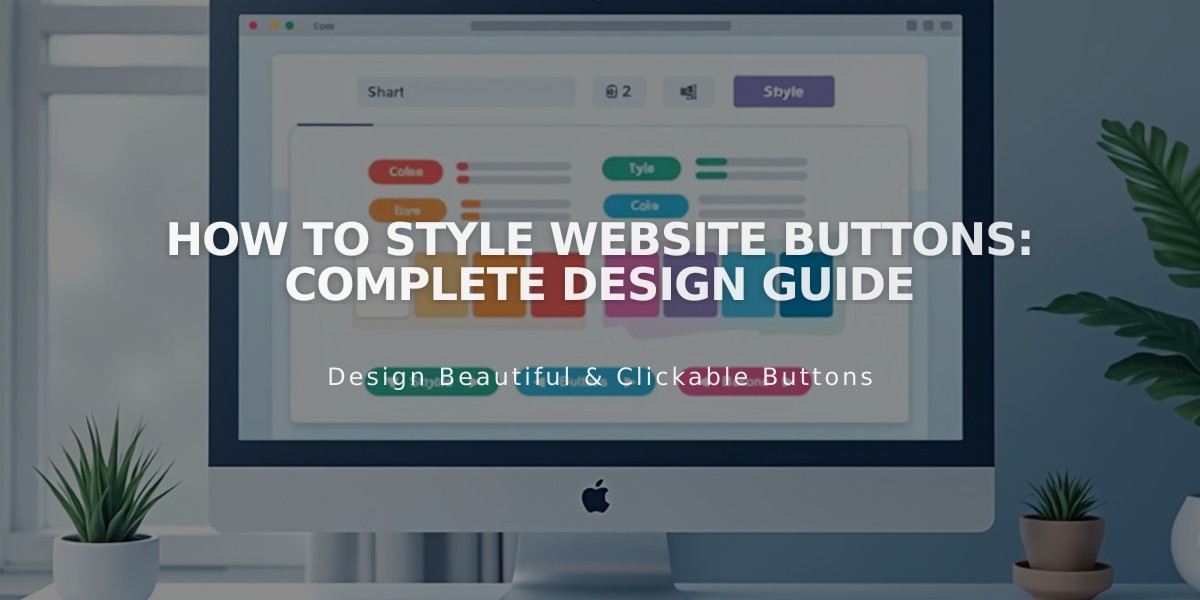
How to Style Website Buttons: Complete Design Guide
Customize buttons to match your brand's visual identity by adjusting their appearance through the Site styles panel. Here's how to style buttons effectively across your website.
Primary Button Components
- Text: Font and styling options
- Shape: Fill or outline options
- Outline thickness
- Horizontal padding
- Vertical padding (except for Fluid Engine sections)
Button Types and Their Applications
Primary Buttons:
- Add to cart
- Checkout buttons
- Donation block
- Newsletter signup
- Member registration
Secondary Buttons:
- Continue shopping
- Alternative CTAs
- Form submit buttons
Tertiary Buttons:
- Cookie management
- Additional navigation options
Color Customization
Colors follow your site's global theme:
- Background color
- Text color
- Hover states
- Outline colors
alt text
Style Guidelines
- Keep button text under 25 characters for optimal appearance
- Use consistent styling across similar button types
- Consider contrast between button and background
- Ensure readable text size and spacing
To Style Buttons:
- Open Site styles panel
- Select button type (Primary, Secondary, or Tertiary)
- Adjust desired properties
- Changes save automatically
Special Considerations:
- Buttons automatically resize to accommodate text
- Some buttons may have template-specific styling options
- Newsletter block buttons maintain fixed padding
- Header and form buttons can be customized separately
Version 7.0 Specific Settings:
- Button style (solid, outline, raised)
- Button shape (square, rounded, pill)
- Custom color options
- Font selection
- Alternative color schemes for different backgrounds
Remember that consistent button styling helps create a cohesive user experience while highlighting important calls to action on your website.
Related Articles
Choose the Perfect Template for Your Squarespace Website