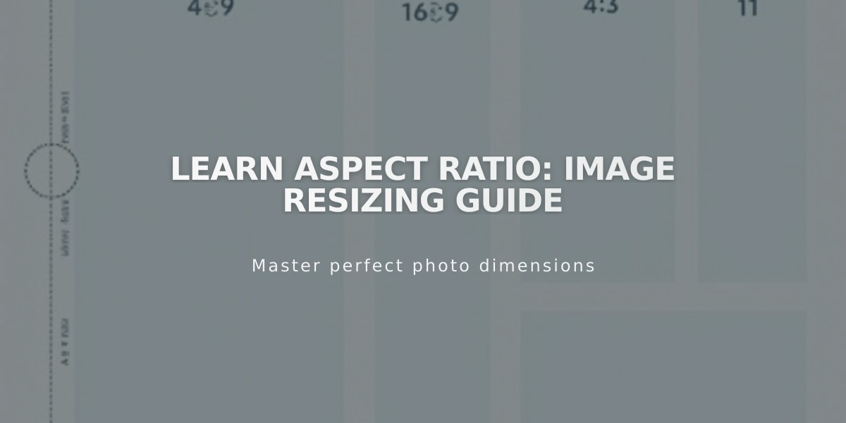
Learn Aspect Ratio: Image Resizing Guide
Aspect ratio is the proportional relationship between an image's width and height, expressed as a ratio like 3:2. Understanding aspect ratios helps maintain consistent image appearances across your website.
Common Aspect Ratios:
- Square (1:1): Equal width and height (e.g., 500px × 500px)
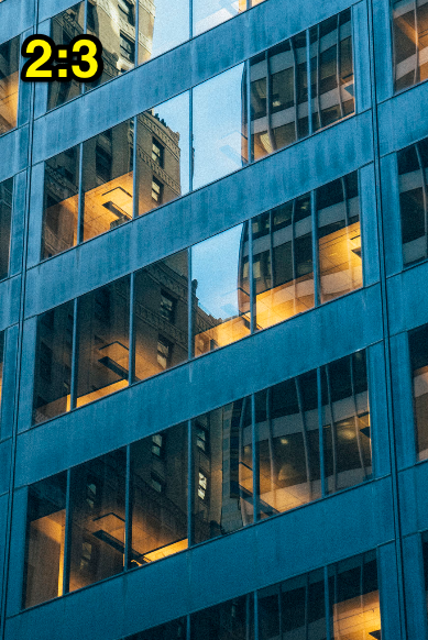
- Portrait (2:3): Height is 1.5 times the width (e.g., 500px × 750px)
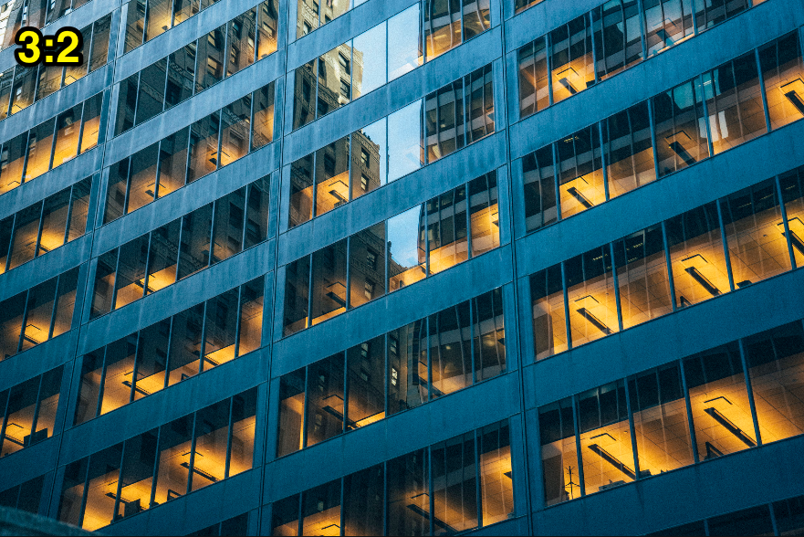
- Landscape (3:2): Width is 1.5 times the height
- Widescreen (16:9): Standard video format
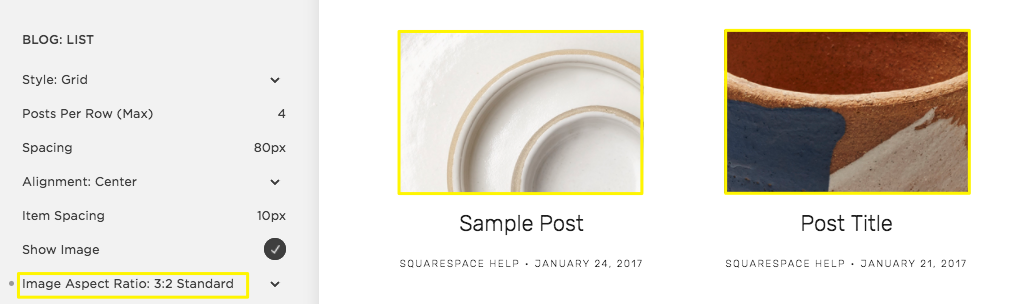
Three brown and white round plates
Tips for Working with Aspect Ratios:
- Use consistent ratios for similar content types (products, blog thumbnails)
- Crop images to match desired ratios rather than forcing specific dimensions
- Crop the shorter side based on the longer side to maintain quality
- Don't scale up images as this can cause blurriness
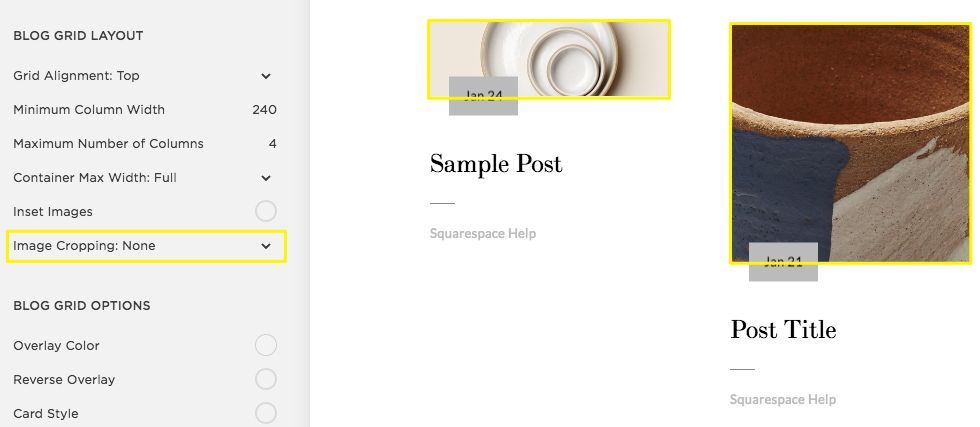
Three white flat plates on a table
Special Considerations:
- Page banners adapt to browser sizes and don't have preset ratios
- Video aspect ratios depend on source files (most use 16:9)
- Product images should maintain consistent ratios for professional appearance
- Gallery displays may require specific ratio settings for uniform appearance
Visual Examples:
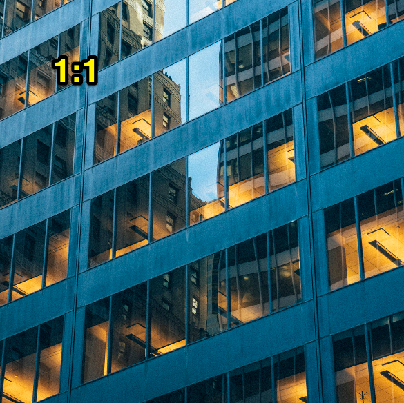
Modern glass building at dusk
High-rise buildings in a nighttime city
Bright windows of buildings at night
Vertical windows of a white modern building
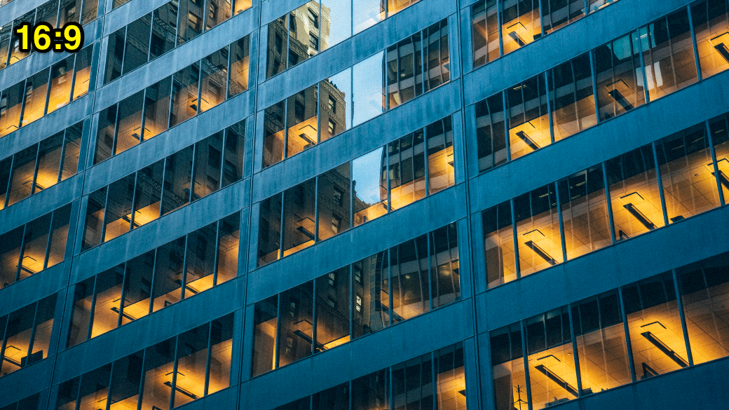
16:9 image reflecting building windows
Related Articles

How to Choose and Customize Your Perfect Squarespace Template - A Complete Guide