
Mobile Styles Guide: Cover Page Display in Version 7.0
On mobile devices, version 7.0 cover pages automatically adjust to ensure optimal viewing and functionality through responsive design. Here's how the layout adapts:
Text and Content Display
- Content automatically stacks in a single column
- Body text should be concise to prevent word cutoff
- Smaller font sizes are recommended for better readability
Layout Transformations
- Split layouts stack vertically (image above text)
- Split text layouts combine with left text above right text
- Harbor layout splits horizontally with map overlay
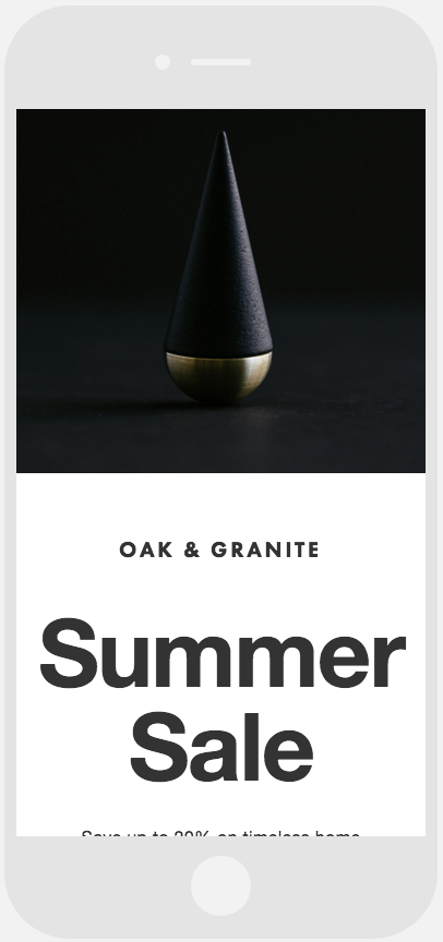
Modern black conical ornament

Ballet dancers posing
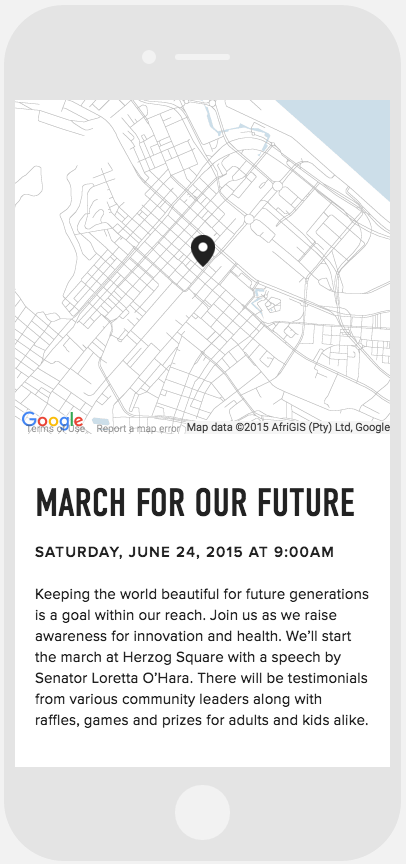
Pin location on map
Background Image Tips
- Avoid images with text or borders
- Choose flexible images that crop well
- No special mobile URL needed - use the same address across devices
Preview Options
- Use device-specific preview tools
- Test on actual mobile devices
- Access through mobile browser using main URL
These mobile optimizations ensure your cover page maintains its visual impact while providing an excellent user experience across all devices.