Mobile Display Guidelines for Cover Page Responsiveness in Version 7.0
Cover Page styles adapt automatically for mobile devices by stacking content in a single column for optimal viewing. Here's what you need to know about mobile responsiveness:
Preview Options
- Use Device View to check appearance on mobile, tablet, and desktop
- Test your site directly on mobile devices by visiting the URL
- Layout adjusts automatically for different screen sizes
Background Images Best Practices
- Choose images without text or borders
- Select images that work well when cropped
- Ensure images remain clear on smaller screens
Text Considerations
- Large font sizes may cause text cutoff on mobile
- Keep body text concise
- Use smaller font sizes when needed
- Add appropriate spacing between words
Layout Changes on Mobile Devices:
Split Layouts:
- Images stack above text
- Maintains readability on smaller screens
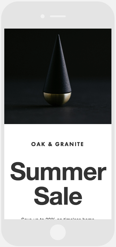
Black cone on a table
Text Arrangements:
- Left-side text stacks above right-side text
- Ensures proper content hierarchy
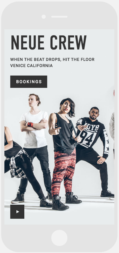
Multi-ethnic group in sportswear
Harbor Layout:
- Map stacks above text
- Maintains functionality on mobile devices
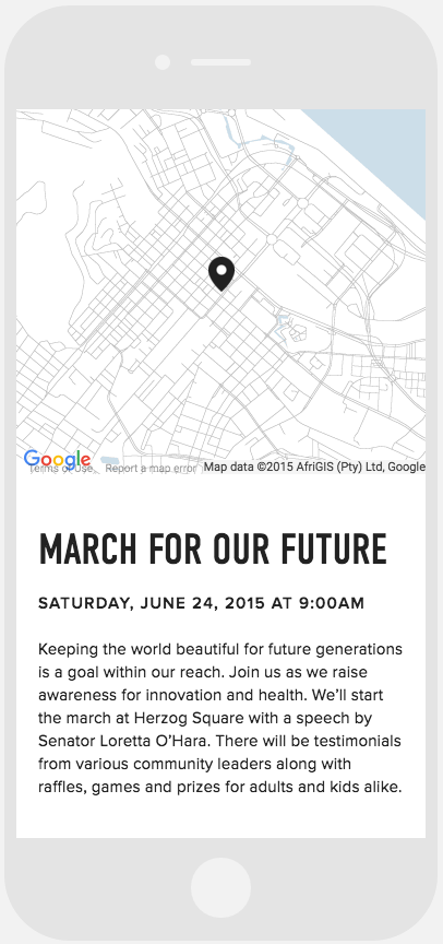
Neighborhood map with pointer
These adjustments ensure your Cover Page remains visually appealing and functional across all devices while maintaining content accessibility and user experience.
Related Articles
Mobile Preview Guide: Cover Page Display in Version 7.0