Navigation Design Guide: Customizing Website Menu Links & Mobile Navigation
Navigation serves as a crucial element in website design, directing visitors to your site's content. Typically displayed at the top, it can also appear in footers or sidebars in some version 7.0 templates.
Before customizing navigation:
- Add pages through the Pages panel
- Update navigation titles in page settings
- Arrange links by dragging pages in the Pages menu
Version 7.1 Navigation Styling:
- Access header editor for primary navigation settings
- Adjust layout, colors, spacing, and padding
- Configure desktop vs. mobile display
- Set fixed positioning options
Version 7.0 Navigation Styling:
- Open Website Styles in the Design menu
- Look for "Navigation" in adjustment options
- Click navigation links in preview to filter relevant settings
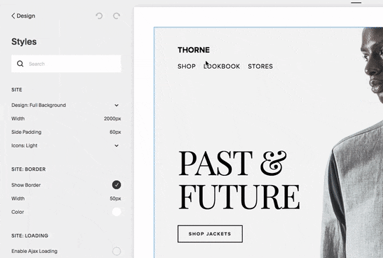
Screenshot of the Thorne shop page
Font and Size Customization:
- Version 7.1: Modify through Fonts > Assign Styles > Website Navigation
- Version 7.0: Adjust through website styles dropdown menu
- Control font family, weight, size, line height, and spacing
Color Settings:
- Version 7.1: Access through header editor > Style > Navigation Color
- Version 7.0: Modify via website styles > Colors section
- Adjust both desktop and mobile color schemes
Layout and Spacing:
- Position varies by template (horizontal/vertical)
- Customize link spacing through padding and margin controls
- Mobile displays use hamburger menu (☰) for better usability
Mobile Navigation Features:
- Collapsible menu behind hamburger icon
- Template-specific mobile styling options
- Customizable menu icon appearance
- Responsive design adjustments
Template-Specific Considerations:
- Navigation display varies by template group
- Different breakpoints for mobile view
- Some templates offer advanced mobile styling
- Custom options for menu icon visibility
Optimization Tips:
- Use short navigation titles
- Group related pages in dropdowns
- Consider secondary navigation for numerous links
- Ensure mobile compatibility
- Maintain consistent branding across devices
Empty Navigation Management:
- Hide menu icons in supported templates
- Customize through Website Styles
- Use custom code solutions where needed (unsupported)
- Consider template switching for specific requirements
Related Articles
Choose the Perfect Template for Your Squarespace Website