

Squarespace Design Guide: Choosing Fonts and Colors for Your Website
Color and typography guide your site's mood and first impression, much like interior design elements shape a room's ambiance. Let's explore how to select the perfect combination for your brand.
Choosing Fonts That Match Your Brand
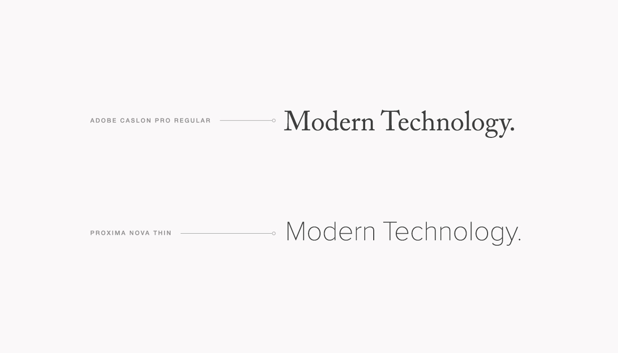
Consider your site's purpose and audience when selecting fonts. Serif fonts (with decorative strokes) convey traditional or formal feelings, while sans-serif fonts (clean lines) appear modern and minimalist.
For web readability, sans-serif fonts often work better due to screen resolution limitations. However, choose based on your content - medieval manuscripts might warrant serif fonts, while modern furniture could suit sans-serif.
Squarespace logo
Key questions to consider:
- What's your site's main purpose?
- Who's your target audience?
- Is your brand playful or serious?
- Do you prefer modern or classic aesthetics?
Creating Effective Font Combinations
The best designs typically use no more than two complementary fonts. Consider pairing:
- Sans-serif with serif fonts
- Simple with decorative styles
- Thin with bold weights
Sans-serif font demonstration
Use different text sizes strategically to create hierarchy and emphasis while maintaining readability throughout your site.
Selecting the Perfect Color Palette
Your color choices should reflect your brand's personality and content. Consider:
- Your existing brand colors
- Your industry's typical palette
- Your content's emotional tone
- Your imagery's dominant colors

Black laptop on wooden desk
Best practices for color selection:
- Stick to a consistent palette
- Maintain high contrast for readability
- Use accent colors sparingly
- Ensure accessibility for all users
- Match colors with your existing imagery
Remember to test your combinations across different devices and keep accessibility in mind. The most effective designs often use a limited palette of 2-3 primary colors with occasional accents.
Your website should feel like a natural extension of your brand. Take time to experiment with different combinations until you find the perfect match for your vision.
Related Articles

Building a Squarespace Website: A Step-by-Step Guide for Beginners