Best practices for Previewing Your Squarespace Site Across Devices
View and test your website's appearance across different devices and browser windows with Squarespace's preview features.
Computer Preview Options:
- View real-time changes in the right-side preview panel while editing
- Click the arrow in the top-right corner to expand to full-screen preview
- See page URLs in the browser address bar
- Hide editing annotations for cleaner viewing
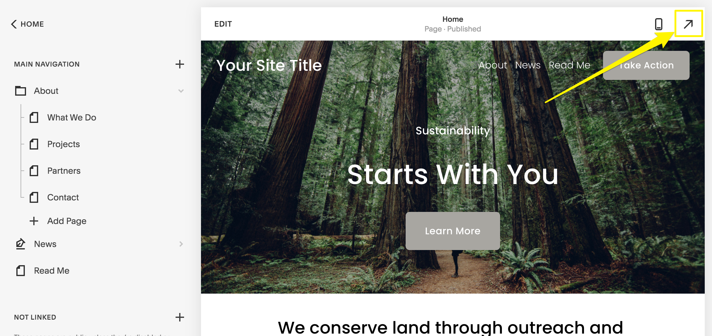
Yellow arrow pointing right
Mobile App Preview Features:
- Use the preview bar at the bottom of phone screens
- Tap the full-screen icon on iPad to expand view
- Switch between mobile and desktop views using the computer icon
- Edit content directly in either view
Blog Post Preview:
- Save post as draft or publish
- Click post title in sidebar
- View preview on right
- Use expand arrow for full-screen view
Additional Preview Methods:
- Device View: Test appearance across different device sizes
- Private browsing: See site exactly as visitors do
- Browser zoom: View site at different widths
- Password protection: Test changes privately
- Template preview: Test style changes before going live
Preview content privately by:
- Disabling pages
- Adding password protection
- Moving pages to Off-Menu section
- Testing template changes before activation
These preview options ensure your site looks perfect across all devices before making changes public.
Related Articles

Squarespace Circle: Understanding Membership Statuses & Points