Customize Your Site's Navigation Styling: Complete Guide to Link Design and Formatting
Navigation links are a crucial part of your site's structure, typically displayed at the top of your website. Here's how to customize them effectively:
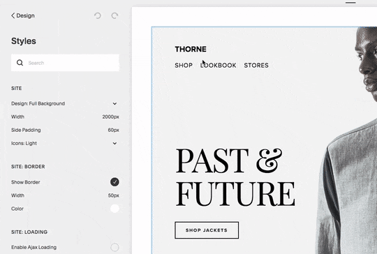
Finding Navigation Style Options
In Version 7.1:
- Navigate to the header editor to modify layout, colors, spacing, and mobile display
- Access Site styles for font and size adjustments
In Version 7.0:
- Open the Design panel and click Site styles
- Look for tweaks containing "Navigation"
- Hover over navigation links in preview to highlight relevant options
headshot of man wearing suit
Font and Size Customization
Version 7.1:
- Open Site styles > Fonts
- Click Assign styles
- Select Site navigation
- Choose Custom for font changes
- Adjust size using presets or custom rem values
Version 7.0:
- Click the v icon next to tweak name
- Modify font name, style, size, line height, and letter spacing
Color Customization
Version 7.1:
- Open header editor
- Click Style
- Select Navigation color
Version 7.0:
- Open Site styles > Colors
- Edit color theme for site header
- Adjust Navigation links tweak
Layout and Mobile Display
- Layout options vary by template (horizontal/vertical positioning)
- Mobile navigation collapses into a menu icon (☰) or "Menu" text
- Customize mobile display through header editor (Version 7.1) or site styles (Version 7.0)
Tips for Mobile Navigation:
- Keep navigation titles concise
- Consider using dropdowns for related pages
- Adjust mobile breakpoint settings when available
- Hide menu icons through site styles in supported templates
For optimal navigation display:
- Test across different devices
- Ensure consistent branding
- Consider user experience in both desktop and mobile views
- Monitor navigation performance and adjust as needed
Related Articles
How to Build Your First Squarespace Website: A Step-by-Step Guide