Fix Unwanted Image Cropping on Squarespace: Complete Guide
Images in Squarespace containers adapt to different browser sizes, often resulting in some cropping. Understanding how this works helps you achieve better visual results across your site.
How Image Cropping Works
Images are displayed in containers that control their presentation. Two main scenarios occur:
- Most common: Image adjusts to container dimensions and crops to fill completely
- Sometimes: Container adjusts to image dimensions to show the entire image
Climber on Rocky Cliff
Image Block Optimization
- Fill setting: Images crop when resizing
- Fit setting: Images maintain original aspect ratio
- Use focal points to control centering
- Add spacer blocks to adjust image size
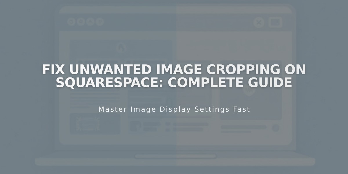
Banner Images
For consistent banner appearance:
- Use images with matching aspect ratios
- Control content overlap to manage banner height
- Adjust banner size in settings
- Set focal points for proper centering
- Check mobile appearance
Background Images
Key considerations:
- Adjust section height/width to show more content
- Images can repeat, fit, or fill screen
- Maximum recommended size: 2500px on longest edge
- Use Site Styles for display settings
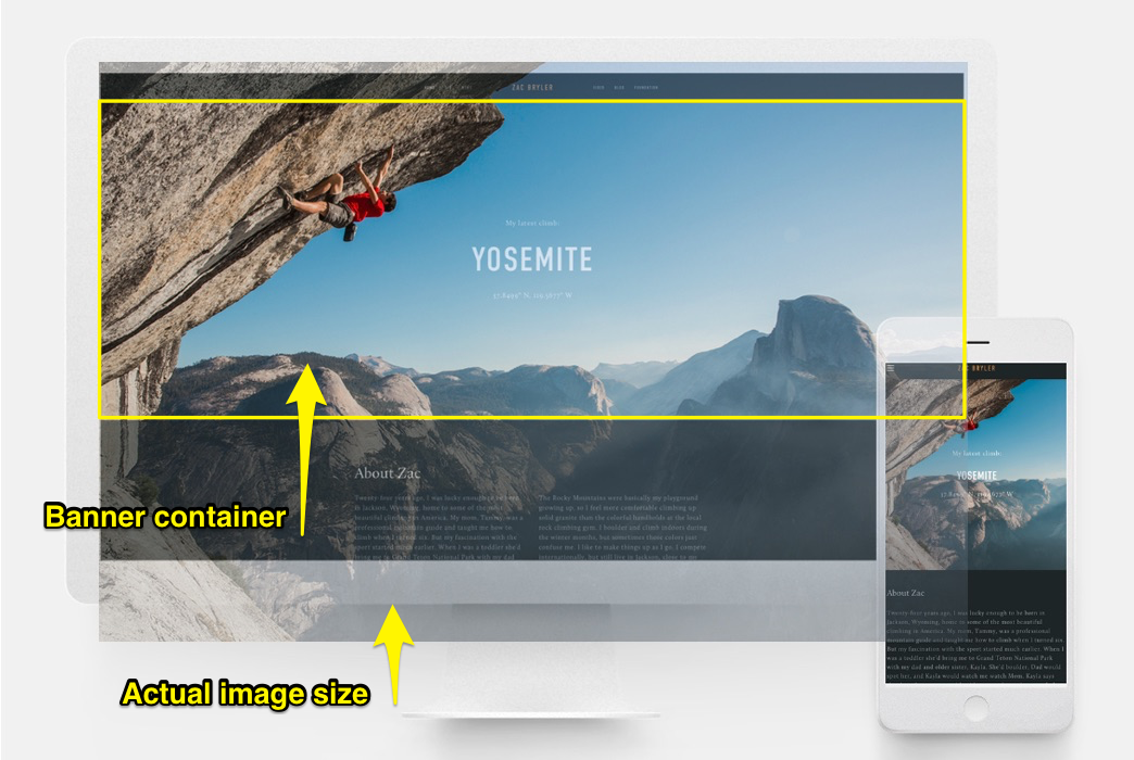
Black Leather Backpack with Buckle
Gallery Management
For optimal gallery presentation:
- Upload images with similar aspect ratios
- Use gallery settings to control display format
- Adjust thumbnails per row in grid layouts
- Set consistent aspect ratios for uniform appearance
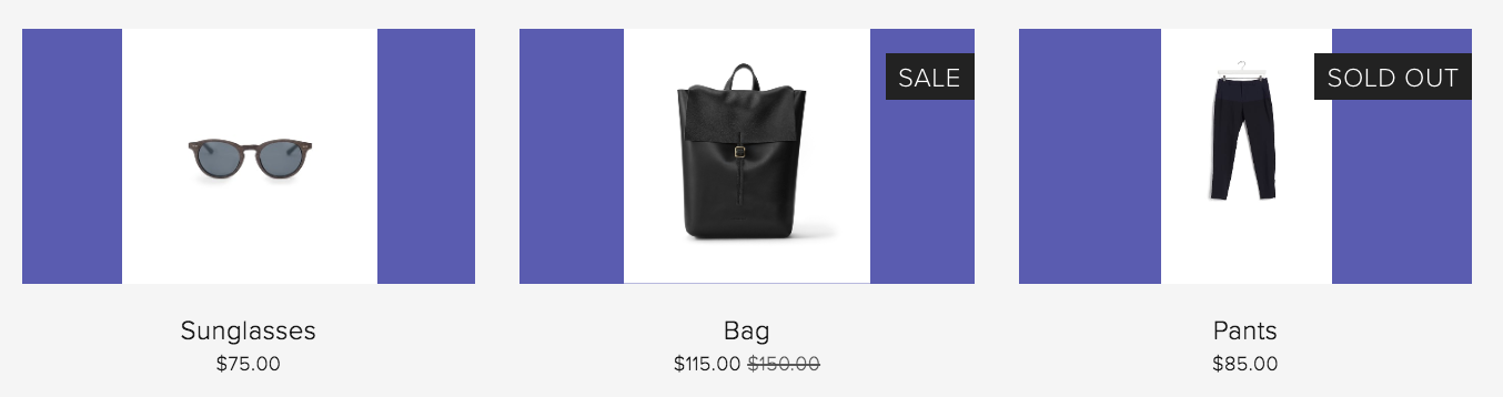
Store Product Images
Best practices:
- Use consistent image orientations
- Maintain similar aspect ratios
- Apply product image auto-crop settings
- Set focal points for proper centering
- Choose appropriate overlay colors

Black Dress on Hanger
Cover pages require special attention as they always experience some cropping, particularly on mobile devices. Factors affecting cropping include image height, browser width, and chosen design.
Related Articles

How to Choose and Customize Your Perfect Squarespace Template - A Complete Guide