Image Cropping Issues: Troubleshooting Guide for Squarespace
Images adjust to fit containers across your site, often resulting in automatic cropping to maintain visual consistency. Here's how to manage cropping in different areas:
Image Blocks
- Original aspect ratio maintained in default view
- Fill mode crops when resized in Fluid Engine
- Fit mode maintains proportions while resizing
- Use focal point tools to control centering
- Reset cropping by double-clicking crop handle
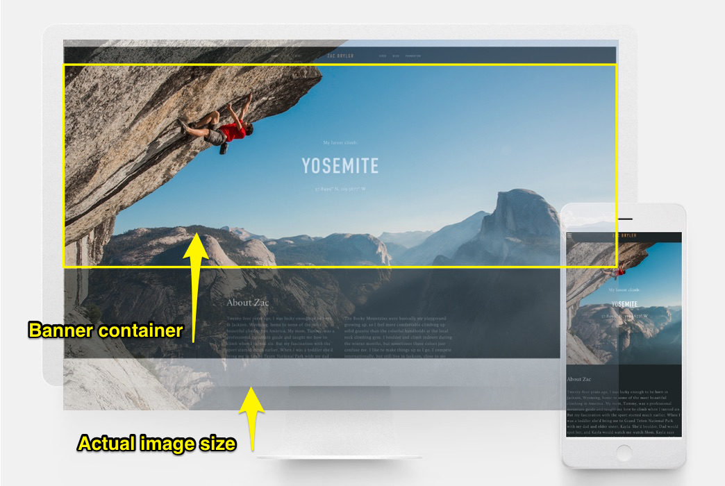
Rock climber scales vertical cliff face
Banners
- Consistent aspect ratios reduce unpredictable cropping
- Content amount affects banner height and crop level
- Adjustable through banner size settings
- Mobile view typically shows more cropping
- Use focal points to optimize image positioning
Background Images
- Control varies by Squarespace version
- Adjust section height/width to reveal more image
- Can be set to repeat, fill, or fit container
- Keep images under 2500px for mobile compatibility
- Configure display settings in site styles
Gallery Sections
- Slideshow: Match image ratios to prevent blank spaces
- Grid: Set uniform aspect ratios and thumbnail counts
- Carousel: Adjust height with crop handles
- Stacked: Images fill available width
Store Products
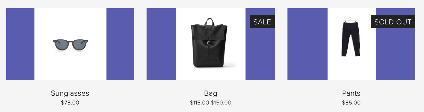
Black leather backpack
- Use consistent aspect ratios for product images
- Adjust store section tweaks for spacing and columns
- Set image aspect ratios in section settings
- Control product overlay colors in classic stores
- Use focal points for optimal centering
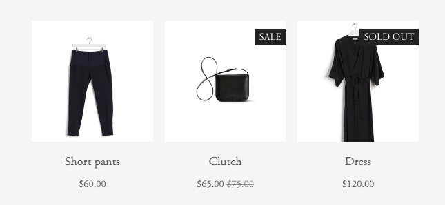
Black dress on wooden hanger
Cover Pages
- Always experience some cropping
- Cropping varies by layout choice
- Mobile displays show increased cropping
- Consider browser width impact
- Layout selection affects crop behavior
For best results:
- Optimize images before upload
- Maintain consistent aspect ratios
- Use focal points strategically
- Consider mobile display requirements
- Test across different screen sizes
Related Articles

Over 200 Fonts Being Withdrawn: What You Need to Know About Font Availability Changes