Image Optimization Guidelines: Understanding Cropping in Squarespace
Images display in containers on your site, which may result in automatic cropping to fit different layouts and screen sizes. Here's how to manage cropping effectively:
Image Block Cropping
- Fill setting: Images crop when resized
- Fit setting: Images maintain aspect ratio when resized
- Use the focal point tool to control image centering
- Add spacer blocks to reduce size without cropping
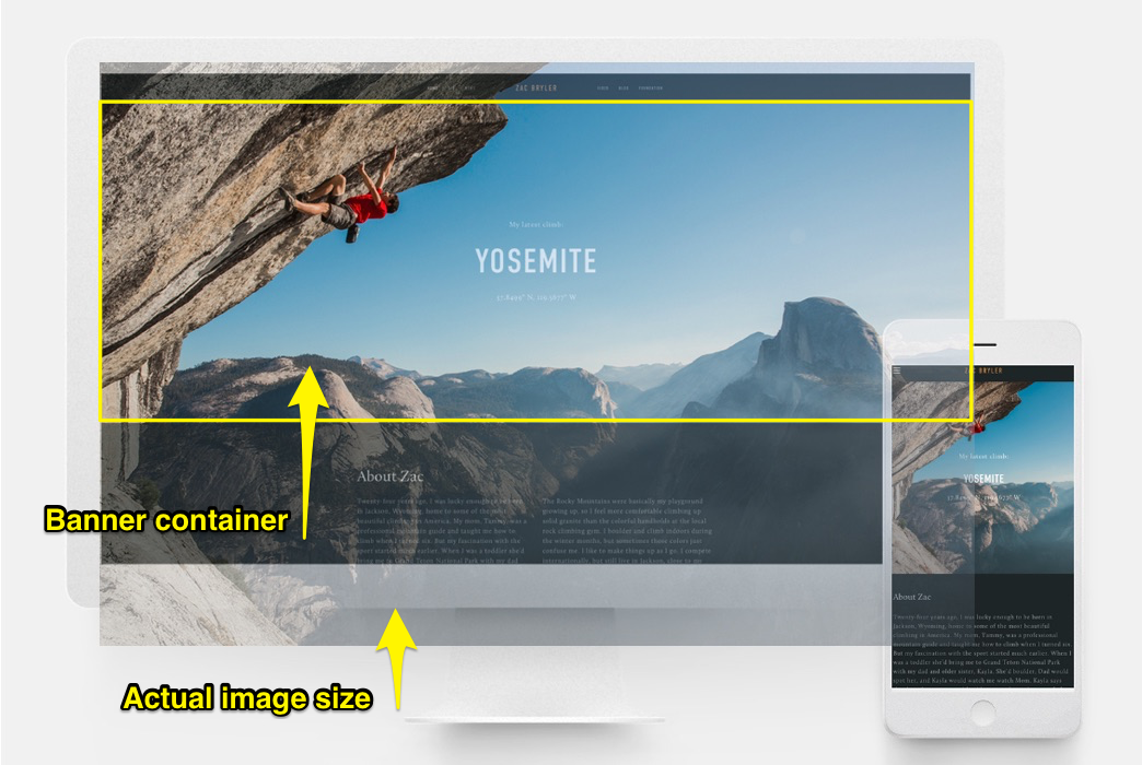
Climber on a rock wall
Banner Images
For best results:
- Use consistent aspect ratios across banners
- Adjust content overlap to control banner height
- Modify banner size settings
- Set focal points for proper centering
- Check mobile appearance
Background Images
Key considerations:
- Adjust section height/width to show more content
- Images can be repeated, fitted, or fill screen
- Keep images under 2500px on longest edge
- Use Site Styles for display settings
- Test appearance on mobile devices
Gallery Display
For optimal gallery presentation:
- Upload similar aspect ratio images
- Adjust gallery height based on image sizes
- Use grid controls to maintain consistent shapes
- Set focal points for each image
- Choose appropriate gallery format (Grid, Slideshow, Carousel, Stacked)
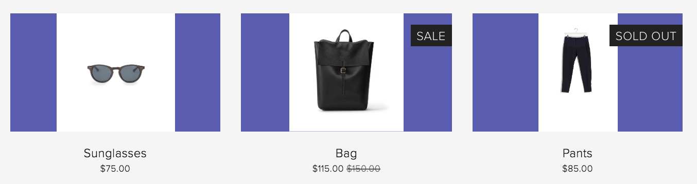
Black leather backpack with buckle
Store Product Images
Best practices:
- Use consistent image orientations
- Maintain similar aspect ratios
- Set product image cropping preferences
- Adjust overlay colors if needed
- Control layout through Store Page settings
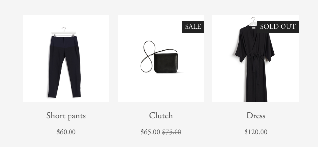
Black dress hanging on hanger
Cover Pages
Important notes:
- Expect partial cropping, especially on mobile
- Cropping varies by layout choice
- Consider image height and browser width
- Test across different devices
- Choose layouts that work with your images
These guidelines help ensure optimal image display across your site while maintaining visual consistency and professional appearance.
Related Articles

How to Choose the Best Squarespace Template for Your Website