Advanced Mobile Styling Features in Squarespace 7.0 Guide
Mobile devices require fonts that are smaller than those used on computer screens. The minimum and maximum text sizes for headings and body text are defined using CSS media queries.
Responsive logos adjust their size based on viewport width. On mobile screens, logos should be compact to avoid taking up too much space. A common approach is to set a maximum logo height of 40-60px for mobile.
Navigation menus typically collapse into a hamburger menu on mobile. The menu icon and items should be large enough for touch interaction (at least 44x44px). Consider adding a sticky header with key navigation elements.
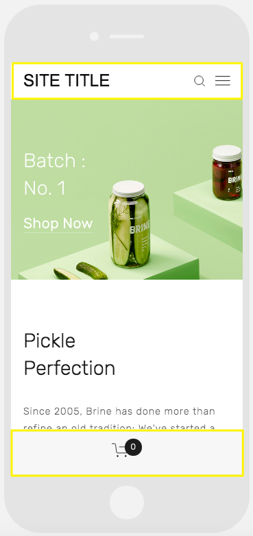
Pickle jar on green background
Support for mobile-specific styling varies by template:
Aviator
- Toggle background image visibility
- Adjust logo sizing
- Configure mobile header colors
Brine
- Single or dual navigation bars
- Optional fixed header
- Custom header icon styles
- Configurable mobile breakpoint
- Mobile-specific store page styling
Farro
- Single or dual navigation bars
- Optional fixed header
- Custom header icon styles
- Hide index page grid titles
- Mobile-specific site title styling
- Separate mobile logo with custom height
Skye
- Font size controls
- Store page styling options
- Logo/site title toggle
Tremont
- Responsive font sizing
- Multi-device logo height settings
- Store page customization
- Mobile navigation colors
- Site title configuration
York
- Font resizing controls
- Mobile top navigation
- Custom header icon styles
- Store page style options
For optimal results:
- Test layouts across multiple devices
- Ensure touch targets are large enough
- Maintain readable text sizes
- Optimize images for mobile loading
- Consider mobile-first design patterns
The mobile styling options allow creating cohesive experiences across devices while maintaining brand identity and usability. Regular testing on actual mobile devices is recommended.
Related Articles
Squarespace Circle: Understanding Membership Statuses & Points