
Mobile Preview Guide for Cover Page Layouts in Version 7.0
Mobile Cover Page Display in Version 7.0
The responsive design of cover pages automatically adjusts content to a single column for optimal viewing on mobile devices. Here's what you need to know about mobile display changes:
Device View Preview
- Use Device View to check appearance across mobile, tablet, and desktop
- Test your site directly on mobile devices by entering the URL in a mobile browser
- The site URL remains the same across all devices
Background Image Guidelines
- Use images without text or borders
- Select images that can be easily cropped
- Avoid complex visuals that may lose impact when scaled down
Text Optimization
- Keep body text concise
- Use moderate font sizes to prevent text cutoff
- Add spacing between words for better readability
Layout Adjustments for Mobile
Split Layouts:
- Images stack above text
- Applies to Flash and Spotlight layouts
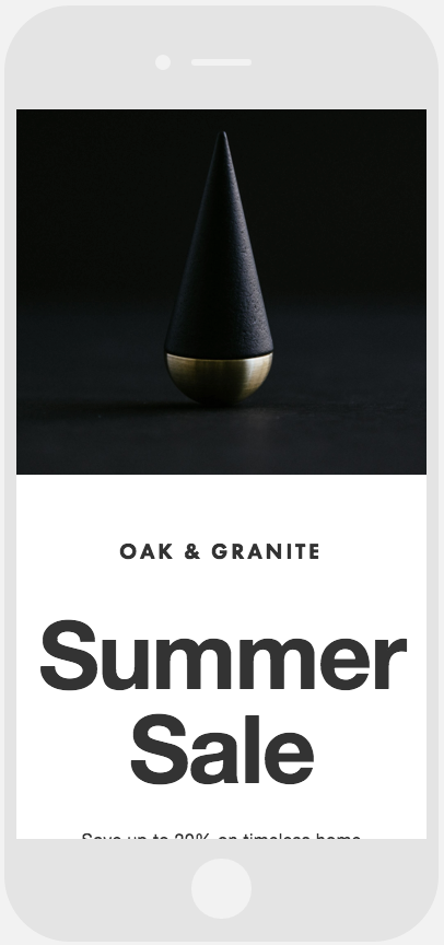
Black and gold conical sculpture
Split Text Layouts:
- Left-side text appears above right-side text
- Common in Debut and Projector layouts
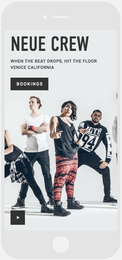
Dramatic pose dancers
Harbor Layout:
- Screen divides horizontally
- Map displays above text content
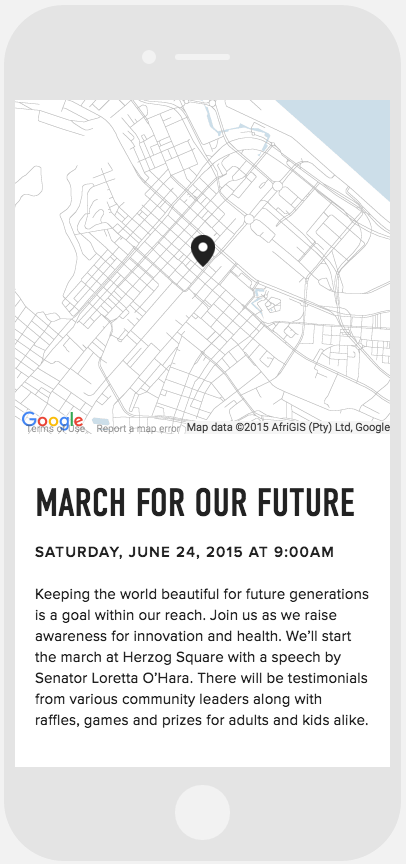
Map with location marker