
Mobile Preview Guide: Cover Page Display in Version 7.0
Cover pages automatically adapt for mobile viewing through responsive design, stacking content into a single column. Here's what you need to know about mobile display:
Using Device View Preview Test your cover page's appearance across different devices using the device view feature. For real-world testing, visit your page URL directly from your mobile browser.
Background Image Guidelines Choose background images without text or borders that can be flexibly cropped. This ensures optimal display across all devices.
Text Considerations To prevent text cut-offs on mobile:
- Keep body text concise
- Use smaller font sizes
- Add spaces between words
- Avoid very large font sizes for longer phrases
Mobile Layout Adjustments Key changes in mobile view:
- Split layouts (Flash and Spotlight):
- Images stack above text
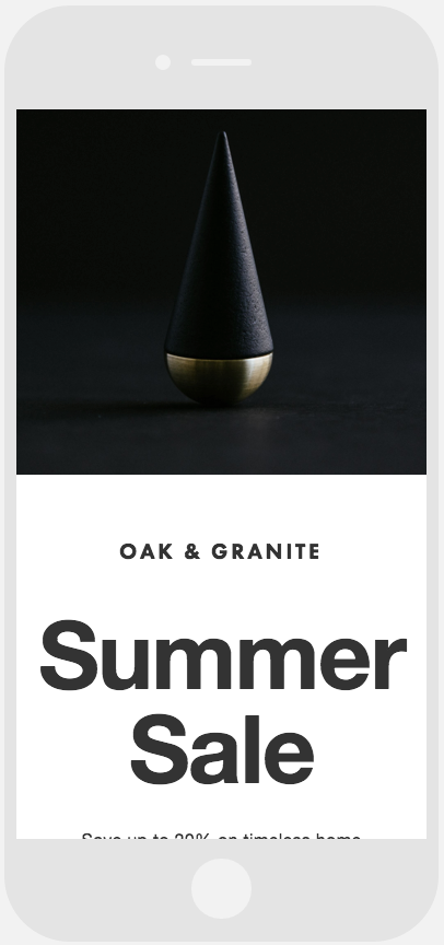
Phone screen showing sale notification
- Split text layouts (Debut and Projector):
- Left-side text stacks above right-side text
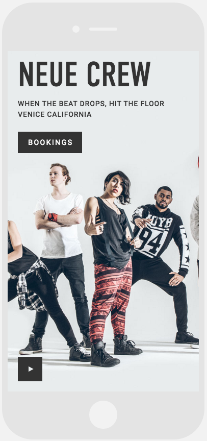
Hip hop dance duo texting
- Harbor layout:
- Map stacks above text in horizontal split
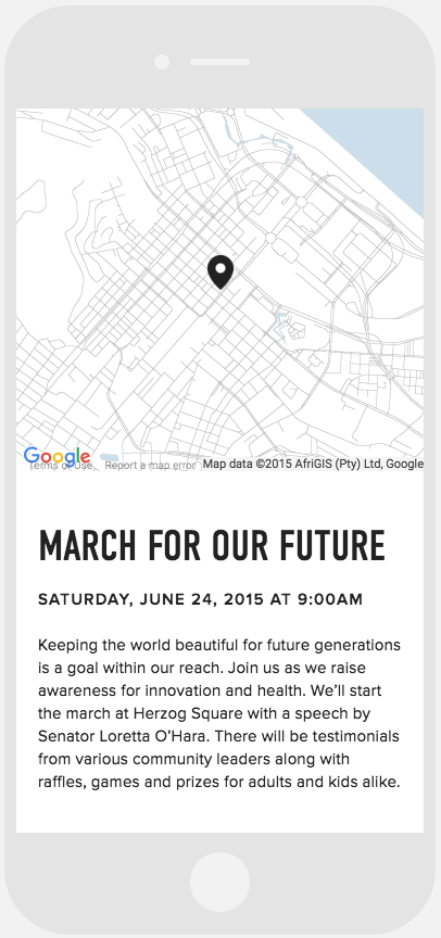
Map showing location pin marker
Remember to test your cover page on various devices to ensure optimal viewing experience for all users.