
Mobile Homepage Layout Updates in Squarespace 7.0: What You Need to Know
A responsive design ensures your homepage adapts seamlessly to mobile devices by stacking content in a single column. Here's what you need to know about mobile display:
Device Preview Test your site's appearance using device view or by visiting the URL directly on your mobile device. No separate mobile URL is needed.
Mobile Background Images Choose background images without text or borders that can be flexibly cropped. This ensures optimal display across all devices.
Text Optimization To prevent text cutoff on mobile:
- Keep body text concise
- Use smaller font sizes
- Add spaces between words
- Avoid extremely large font sizes for longer phrases
Layout Adjustments When viewed on mobile devices:
- Split layouts stack vertically (image above text)
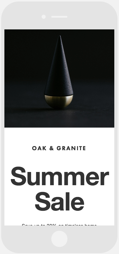
Black and gold metal cone
- Split text layouts stack left text above right text

Four dancers in artistic poses
- Harbor layout splits horizontally (map above text)
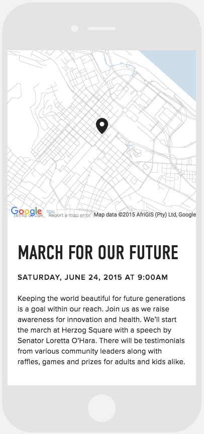
Map with location marker
These adjustments ensure optimal viewing experience across all device sizes while maintaining content hierarchy and readability.