Mobile-Specific Styling Features in Squarespace 7.0: Comprehensive Guide
Squarespace Version 7.0 offers specialized mobile styling options to enhance your website's appearance on smartphones and tablets. While all Squarespace sites feature responsive design by default, certain templates provide additional mobile customization features.
Mobile Style Options by Template Family
Aviator
- Toggle background images
- Adjust logo size (except info pages)
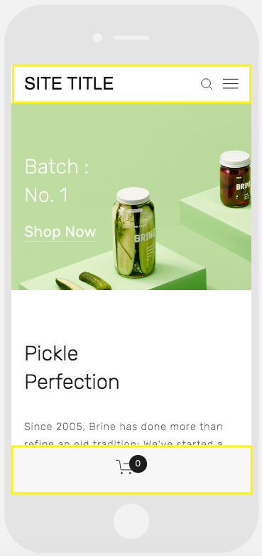
Brine
- Configure dual navigation bars
- Fixed top bar option
- Custom header icon styles and placement
- Adjustable mobile breakpoint
- Shop page customization
Farro
- Dual navigation bar support
- Fixed top bar settings
- Custom header icons with placement options
- Shop page styling
- Index page thumbnail grid title controls
- Website title customization
- Separate mobile logo options
Skye
- Font scaling controls
- Shop page styling options
- Logo/website title toggle
Tremont
- Responsive font scaling
- Multi-device logo sizing
- Shop page customization
- Website title styling
- Mobile navigation background colors
York
- Font scaling
- Mobile navigation bar
- Custom header icon styles
- Shop page styling
Jar on green background
Key Mobile Features
Font Scaling Set maximum and minimum sizes for headings and text to ensure readability across devices.
Logo Sizing Adjust logo dimensions specifically for mobile views to prevent overcrowding.
Navigation Bars Customize mobile-specific navigation with:
- Top/bottom placement options
- Color customization
- Element positioning
- Distinct mobile styling
Shop Pages Modify product displays with mobile-specific:
- Title styling
- Price formatting
- Sale price appearance
To access these options:
- Open device view
- Navigate to Website Styles
- Search for "mobile" or "min" for scaling options
These features ensure your website maintains its visual appeal and functionality across all devices while allowing for detailed mobile-specific customization.
Related Articles
Squarespace Circle: Understanding Membership Statuses & Points