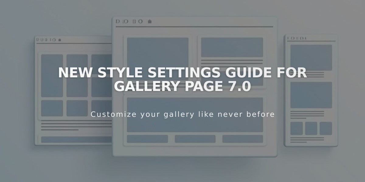
New Style Settings Guide for Gallery Page 7.0
Content is displayed in a grid, stack, slideshow, or carousel format depending on your template. Most templates use a standard Gallery Page with grid or slideshow options.
Standard Gallery Page Customization:
Layout Options
- Slideshow: Shows one image at a time with optional autoplay
- Grid: Displays content in customizable rows and columns
- Stack: Single column display with minimal padding
- Carousel: Horizontal scrolling content
Slideshow Settings
- Navigation style (thumbnails, bullets, numbers, dots)
- Arrow appearance and positioning
- Aspect ratio and auto-cropping
- Caption overlay options
- Transition effects (fade or scroll)
- Autoplay and loop settings
Grid Settings
- Customizable aspect ratio
- Adjustable grid spacing
- Column width control
- Lightbox style (dark or light)
- Caption display options
Caption Display
- Always show
- Show on hover
- Hide
- Customizable background color
Mobile-Friendly Features
- Responsive design
- Device-specific preview
- Optimized layouts for smaller screens
Additional Features
- Keyboard navigation support
- Deep linking capabilities
- Click-through URLs
- Custom autoplay settings
- Multiple gallery combinations possible
Templates with unique Gallery Pages include Avenue (slideshow), Flatiron (stack), Forte (carousel), Ishimoto (carousel), Momentum (slideshow), Montauk (stack), Supply (stack), Tremont (multiple layouts), Wells (slideshow/grid), and Wexley (grid).
For enhanced flexibility, consider using gallery blocks on layout pages or combining multiple gallery types using summary blocks.
Related Articles

How to Switch from Marquee to Brine Template: Migration Guide

