
Report: Mobile Design Changes for Cover Page on Version 7.0
On mobile devices, cover pages in Version 7.0 automatically adapt to ensure optimal viewing and functionality. The responsive design system intelligently stacks content vertically in a single column, creating a seamless mobile experience.
To preview your mobile layout:
- Use the device view feature to check appearance across devices
- Visit your website directly on your mobile device
- Enter the same URL as desktop - no separate mobile address needed
Key considerations for mobile optimization:
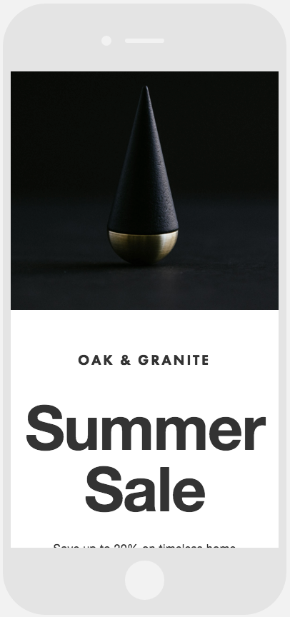
Background Images:
- Choose images without text or borders
- Select visually flexible images that work well when cropped
- Follow background image best practices for optimal display
Text Formatting:
- Keep body text concise
- Use moderate font sizes to prevent word cutoff
- Add appropriate spacing between words
- Avoid very large font sizes for better readability
Black and Gold Squarespace Logo
Layout Adjustments:
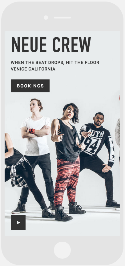
- Split layouts (Flash and Spotlight):
- Images stack above text
- Maintains visual hierarchy
Dancers Posing in Ballet Studio
- Split text layouts (Debut and Projector):
- Left-side text positions above right side
- Creates logical reading flow
City Map Snippet with Street Layout
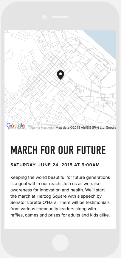
- Harbor layout:
- Card appears above text
- Maintains clean, organized structure
These mobile adaptations ensure your cover page remains professional and functional across all devices while preserving your content's impact and accessibility.