Mobile-Specific Customization Options for Squarespace 7.0 Templates
Mobile Style Options in Squarespace 7.0
Squarespace 7.0 templates feature responsive design that automatically adjusts to any device, with some templates offering additional mobile-specific customization options.
Accessing Mobile Settings:
- Use device preview to see mobile layout
- Press Ctrl+F (Command+F on Mac) to search for "mobile"
- Search for "minimum" to find font scaling options
Template-Specific Features:
Aviator
- Toggle background image visibility
- Adjust logo size (except on information pages)
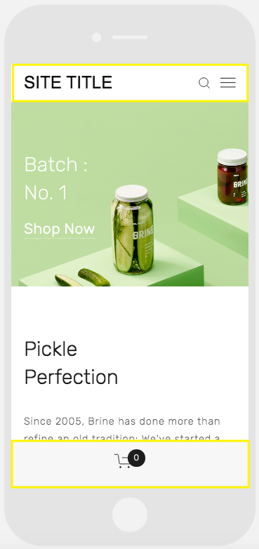
Brine
- Configure up to two mobile navigation bars
- Adjustable top bar pinning
- Customizable header icon styles and positions
- Configurable mobile breakpoint width
- Store page styling options
Farro
- Dual mobile navigation bars
- Pinnable top bar
- Custom header icon styles
- Adjustable icon positioning
- Store styling options
- Thumbnail grid title visibility
- Site title customization
- Mobile-specific logo options
Green background with a white pickle jar
Skye
- Font scaling capabilities
- Store page customization
- Logo-to-site-title toggle
Tremont
- Font scaling
- Device-specific size settings
- Store styling options
- Site title customization
- Mobile navigation background adjustment
York
- Font scaling
- Top mobile navigation
- Header icon customization
- Store page styling options
Key Mobile Features:
- Font Scaling: Set maximum and minimum sizes for all text elements
- Logo Sizing: Optimize logo appearance for mobile devices
- Navigation Bars: Customize top or bottom bars with header elements, colors, and positioning
- Store Styling: Apply mobile-specific designs for product displays, titles, and pricing
These features ensure optimal viewing and functionality across all mobile devices while maintaining brand consistency.
Related Articles

How to Connect a Squarespace Domain to Your Website