Advanced Mobile Styling Options in Squarespace 7.0
Advanced mobile customization in version 7.0 allows you to enhance your site's appearance on mobile devices beyond the default responsive design. Different template families offer unique mobile styling options through the Site Styles panel.
To access mobile settings:
- Open Device View to preview changes
- Use Ctrl + F (Command + F on Mac) to search for "Mobile"
- For font settings, search for "Min"
Template-Specific Mobile Options:
Aviator
- Background image toggle
- Logo size adjustment
- Custom background colors
Brine
- One or two mobile navigation bars
- Fixed top bar option
- Header icon customization
- Mobile breakpoint settings
- Shop page styling
Farro
- Dual mobile navigation bars
- Fixed top bar
- Header icon customization
- Shop page styling
- Index page thumbnail grid options
- Site title customization
- Separate mobile logo options
Skye
- Font scaling
- Shop page customization
- Logo/site title toggle
Tremont
- Font scaling
- Multi-device size settings
- Shop page styling
- Navigation background color
- Site title customization
York
- Font scaling
- Top mobile navigation
- Header icon styling
- Shop page options
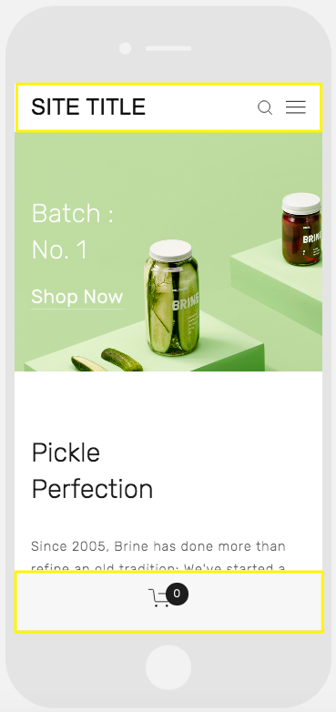
A smartphone displaying a website
Key Features:
Font Scaling
- Manually set maximum and minimum text sizes
- Customize titles, headers, and key text elements
Logo Optimization
- Reduce logo size for mobile viewing
- Option for separate mobile logos in some templates
Mobile Navigation Bars
- Top or bottom placement
- Customizable colors and elements
- Header elements integration (logo, cart, search)
- One or two bar options in select templates
Shop Page Customization
- Mobile-specific product title display
- Price and promotional price styling
- Enhanced shopping experience for mobile users
Related Articles
How to Switch from Marquee to Brine Template: Migration Guide