How to Style Navigation Links: Font, Color & Layout Guide
Navigation is a crucial element that directs visitors to your site's content, typically appearing at the top of the page. Here's how to customize your navigation's appearance effectively.
Basic Navigation Setup
- Add pages via the Pages panel (unlinked pages won't display)
- Customize link text through Page Settings > Navigation Title
- Reorder menu items by dragging pages in the Pages panel
Styling Navigation Links
Font and Size:
- Access through Site Styles > Fonts
- Set custom font family, weight, and style
- Adjust size using presets or custom rem values
Colors:
- Edit in header editor under Navigation Color
- Customize link colors and social media icons
- Modify mobile header overlay theme
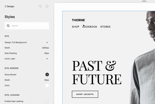
Man between "Past and Future"
Layout and Spacing:
- Adjust position and spacing in header settings
- Customize desktop and mobile appearances
- Control padding and alignment between links
Mobile Navigation Features:
- Collapses into hamburger menu (☰) on mobile devices
- Customizable menu icon style and position
- Inherits desktop styles for brand consistency
Template-Specific Options:
- Navigation positioning varies by template
- Some templates offer advanced mobile styling
- Hover and active state customization available
- Dropdown menu support in select templates
Best Practices:
- Keep navigation titles concise
- Use dropdown menus for related pages
- Consider mobile responsiveness when adding links
- Maintain consistent styling across devices
Tips for Optimal Display:
- Group related pages in dropdown menus
- Consider secondary navigation for additional links
- Test navigation on multiple devices
- Ensure proper contrast between text and background
Remember to regularly test your navigation across different devices to ensure optimal user experience.
Related Articles
How to Build Your First Squarespace Website: A Step-by-Step Guide