Understand Image Ratio: A Complete Guide to Image Sizing in Squarespace
Image ratio is the proportional relationship between an image's width and height, defining its shape. This ratio is expressed as width:height, such as 3:2 or 1:1.
A 1:1 ratio creates a perfect square - whether the image is 500×500 pixels or 1500×1500 pixels. A 2:3 ratio means the height is 1.5 times greater than the width (e.g., 500×750 px or 1500×2250 px).
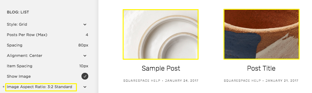
Ceramic bowls with abstract patterns
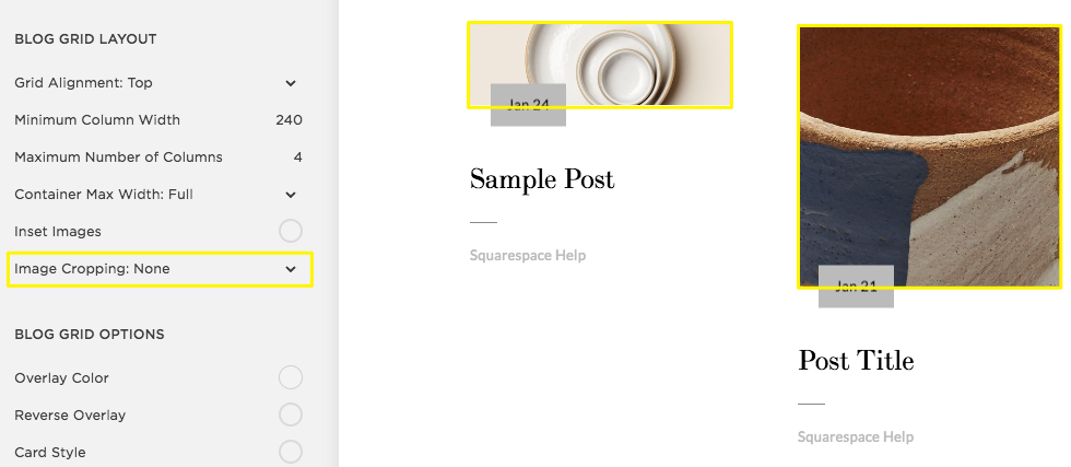
"Choose cropped or full image"
Tips for Working with Image Ratios:
- Start with images that share the same ratio for consistent cropping
- Use crop handles to adjust image height when needed
- For product images, maintain consistent ratios across all photos
- Manual cropping to specific ratios ensures uniformity
- When cropping, adjust the shorter side based on the longer side to maintain quality
Video Considerations:
- Uploaded videos typically display in 16:9 ratio
- Other ratios may show black bars on the sides
- Embedded video ratios depend on the hosting service's thumbnail
Common Image Ratios Example:
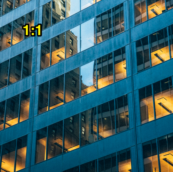
Commercial building lit up at night
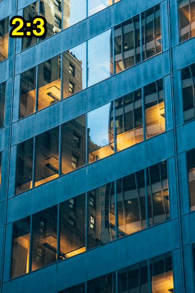
Glass mirrored office building

Modern commercial building at dusk
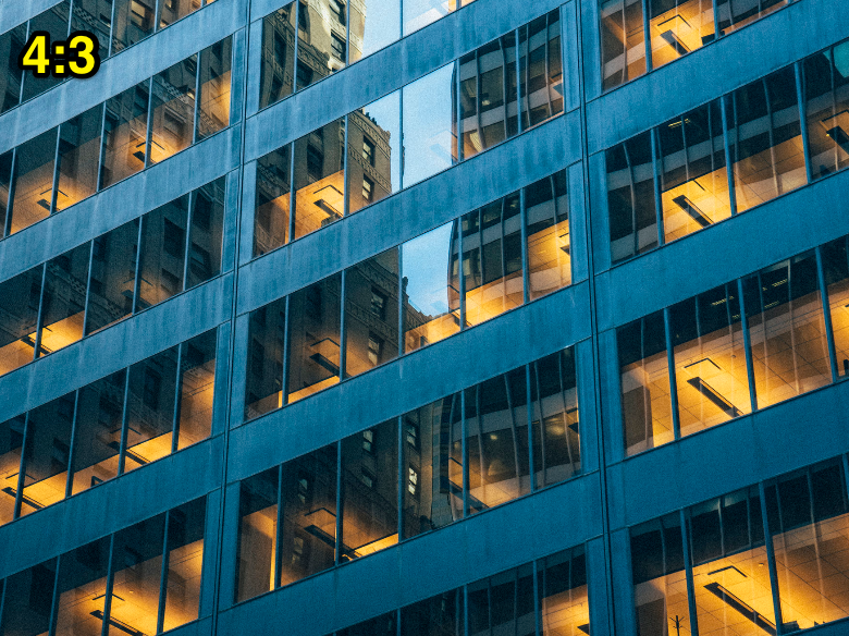
Blue commercial building with large windows
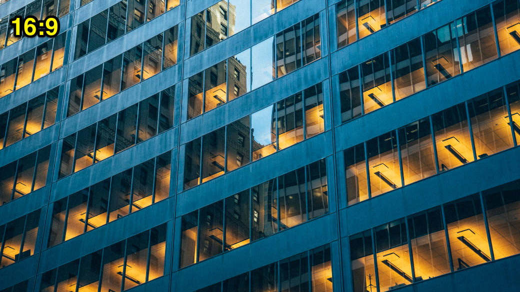
Illuminated blue glass building
For page banners:
- No predefined ratios
- Stretches to fit various browsers
- Maintain consistent ratios for fixed-height banners
- Follow image formatting guidelines before uploading
When working with percentage-based ratios:
- 100% = square image
- Below 100% = landscape orientation
- Above 100% = portrait orientation
- Calculate exact ratios by dividing height by width (e.g., 2:3 ratio = 150%)
Related Articles

How to Create a Manual Multilingual Website in Squarespace